
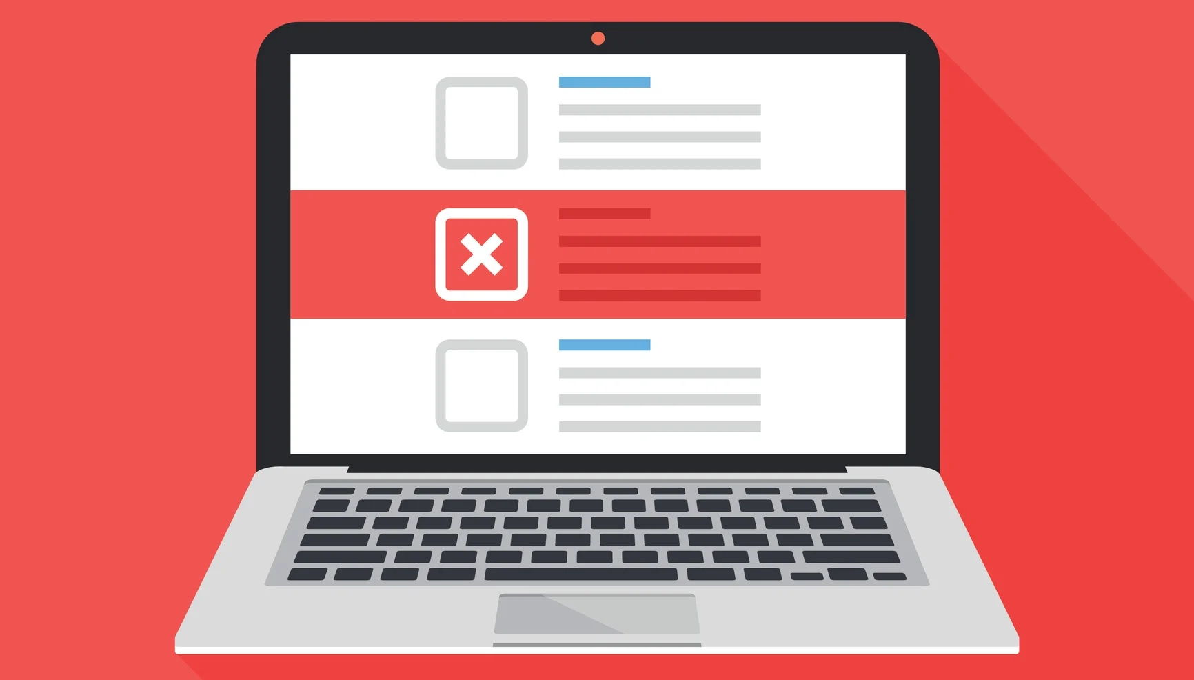
10 Website Mistakes That Are Costing You Customers (And How to Fix Them)
Your website has 3 seconds to make a first impression. Are these common mistakes driving potential customers straight to your competitors?
In today's digital landscape, your website is often the first—and sometimes only—interaction potential customers have with your business. Studies show that users form an opinion about your website in just 50 milliseconds, and 38% of visitors will stop engaging if they find the layout unattractive.
Yet many businesses unknowingly sabotage their own success with website mistakes that instantly erode trust, frustrate visitors, and send potential customers running to competitors. The cost? According to research, poor user experience can reduce conversion rates by up to 70%.
The good news? Most of these mistakes are entirely fixable. Here are the 10 most common website mistakes that could be costing you customers—and the specific steps to eliminate them.
1. Generic, Me-Too Messaging That Says Nothing
The Mistake: Your headline reads something like "Professional Services You Can Trust" or "Quality Solutions for Your Business." Sound familiar? These generic messages are website death sentences because they force visitors to work hard to understand what you actually do.
Why It Kills Conversions: When visitors can't immediately understand your value proposition, they leave. Your messaging should answer three questions within 5 seconds: What do you do? Who do you help? Why should they care?
The Fix: Replace generic messaging with specific, outcome-focused headlines:
- Instead of: "Professional marketing services"
- Use: "Increase your website inquiries by 40% in 60 days"
Test your current headline with the "stranger test"—show your homepage to someone unfamiliar with your business and ask them to explain what you do. If they can't, rewrite it.
2. Hidden or Confusing Contact Information
The Mistake: Your phone number is buried in the footer, your contact form requires 12 fields, or visitors have to hunt through multiple pages to find out how to reach you. Some businesses even hide their contact information behind "Contact Us" pages with no clear next steps.
Why It Kills Conversions: When potential customers are ready to buy, friction kills sales. Every additional click or search for contact information is an opportunity for them to reconsider or get distracted.
The Fix: Make contact effortless:
- Phone number in the header of every page
- Clear contact button above the fold
- Multiple contact options (phone, email, contact form)
- Expected response time clearly stated
- One-click booking for service businesses
Amazon's "1-Click" ordering revolutionised e-commerce because it eliminated friction. Apply the same principle to your contact process.
3. Slow Loading Speeds That Test Patience
The Mistake: Your website takes more than 3 seconds to load. While this might seem minor, it's actually devastating to your business. Google data shows that as page load time increases from 1 to 5 seconds, bounce rate increases by 90%.
Why It Kills Conversions: Modern consumers expect instant gratification. A slow website signals poor business management and outdated technology, eroding trust before visitors even see your content.
The Fix: Optimise for speed with these strategies:
- Compress images using tools like TinyPNG
- Choose fast hosting (platforms like Webflow include speed optimisation)
- Minimise plugins and unnecessary scripts
- Use a content delivery network (CDN)
- Enable browser caching
Test your speed at PageSpeed Insights and aim for scores above 90. Every second faster can increase conversions by up to 2%.
4. Mobile Experience That Frustrates Users
The Mistake: Your website looks great on desktop but becomes unusable on mobile devices. Text is too small, buttons are hard to tap, or the layout completely breaks on smaller screens.
Why It Kills Conversions: Over 60% of web traffic now comes from mobile devices. If your mobile experience is poor, you're essentially closing your business to the majority of potential customers.
The Fix: Implement true mobile-first design:
- Large, tappable buttons (minimum 44px)
- Readable text without zooming (16px minimum)
- Simplified navigation for small screens
- Fast mobile loading (under 2 seconds)
- Mobile-optimised forms with minimal fields
Test your mobile experience regularly on actual devices, not just browser previews.
5. Weak or Missing Social Proof
The Mistake: You have no testimonials, generic stock photos, or social proof that feels fake or outdated. Alternatively, you might have great testimonials buried where no one can find them.
Why It Kills Conversions: Trust is the foundation of online sales. Without credible social proof, visitors have no reason to believe you can deliver on your promises. Generic testimonials like "Great service!" provide no value.
The Fix: Build powerful social proof:
- Specific testimonials with real names, photos, and results
- Video testimonials when possible (50% more trusted)
- Case studies with measurable outcomes
- Client logos and recognisable brands
- Review scores from Google, Trustpilot, or industry platforms
Example of strong testimonial: "Nick's website increased our patient bookings by 45% in the first month. We're finally attracting premium clients instead of price shoppers." - Dr. Sarah Mitchell, Elite Aesthetics Clinic
6. Unclear Value Proposition and Differentiation
The Mistake: Visitors can't quickly understand why they should choose you over competitors. Your unique selling points are buried in paragraphs of text, or worse, you don't clearly communicate what makes you different.
Why It Kills Conversions: In competitive markets, unclear differentiation forces customers to choose based on price alone. If you can't articulate your unique value, you become a commodity.
The Fix: Create crystal-clear differentiation:
- Lead with your strongest differentiator
- Use specific, measurable benefits
- Address customer pain points directly
- Highlight what competitors don't offer
- Make it scannable with bullet points or short sentences
Instead of "We provide excellent customer service," try "24-hour response guarantee—or your first month is free."
7. Overwhelming Visitors with Too Many Choices
The Mistake: Your homepage has 15 different call-to-action buttons, multiple navigation menus, and so many options that visitors don't know where to start. This "analysis paralysis" leads to no action at all.
Why It Kills Conversions: The paradox of choice is real. Research shows that reducing options can increase conversions by up to 300%. When everything is important, nothing is important.
The Fix: Simplify the user journey:
- One primary call-to-action per page
- Clear visual hierarchy guiding the eye
- Maximum 7 items in main navigation
- Progressive disclosure of information
- Single conversion goal per page
Netflix simplified their homepage to focus on one action: "Get Started." This focus helped them become a global phenomenon.
8. Poor Form Design That Creates Friction
The Mistake: Your contact forms ask for unnecessary information, lack clear error messages, or don't provide confirmation when submitted. Long forms with mandatory fields for information you don't actually need create unnecessary barriers.
Why It Kills Conversions: Forms are conversion gatekeepers. Poor form design can reduce completion rates by 50% or more. Every additional field decreases completion rates by approximately 3%.
The Fix: Optimise forms for completion:
- Ask only for essential information
- Use single-column layouts
- Provide clear error messages
- Show progress indicators for long forms
- Include confirmation messages
- Make phone numbers optional
HubSpot found that reducing form fields from 4 to 3 increased conversions by 25%.
9. Lacking Trust Signals and Credibility Markers
The Mistake: Your website looks unprofessional with outdated design, broken links, typos, or missing security certificates. You might also lack professional credentials, certifications, or industry affiliations.
Why It Kills Conversions: Trust is fragile online. Small details like SSL certificates, professional design, and error-free content signal competence and reliability. Their absence suggests unprofessionalism.
The Fix: Build comprehensive trust signals:
- SSL certificate (https://) for security
- Professional photography instead of stock images
- Industry certifications and credentials
- Business address and contact information
- Privacy policy and terms of service
- Professional email addresses (not Gmail)
- Regular content updates showing active management
Display trust signals prominently—they should be visible, not hidden in footers.
10. No Clear Next Steps or Call-to-Action Strategy
The Mistake: Visitors reach the end of your content and don't know what to do next. Your calls-to-action are weak ("Click here," "Learn more") or competing with each other. There's no logical progression from interest to action.
Why It Kills Conversions: Without clear direction, motivated visitors become lost visitors. Even interested prospects need explicit guidance on next steps.
The Fix: Create a strategic CTA hierarchy:
- Primary CTA for ready-to-buy visitors ("Book Consultation")
- Secondary CTA for those needing more information ("Download Guide")
- Action-oriented language that creates urgency
- Benefits-focused rather than feature-focused
- Strategic placement throughout the page
Instead of "Submit," use "Get My Free Analysis." Instead of "Learn More," use "See How We Increased Revenue 40%."
The Compound Effect of Website Optimisation
These mistakes rarely exist in isolation—they compound to create a poor overall user experience. The good news? Fixing them creates a compound positive effect that can dramatically improve your conversion rates.
Real-World Results:Businesses that systematically address these issues typically see:
- 25-50% increase in time on site
- 30-70% improvement in conversion rates
- 40-60% more qualified leads
- Higher average project values due to improved trust
Your Next Steps
Don't try to fix everything at once. Prioritise based on impact:
- Week 1: Fix messaging and value proposition clarity
- Week 2: Optimise mobile experience and loading speed
- Week 3: Improve contact process and forms
- Week 4: Add social proof and trust signals
Need help transforming your website from a business liability into a customer acquisition system?
At MakeNoise, we specialise in identifying and fixing the exact mistakes that are costing you customers. Our systematic approach has helped businesses increase website inquiries by 40% or more by eliminating these conversion killers.
Ready to stop losing customers to website mistakes?
Book your free consultation and discover exactly what's driving visitors away—and how to fix it.
Your competitors are making these mistakes too. Fix yours first, and watch your conversion rates soar.

Read more Articles
Stay ahead of design trends, learn from industry experts, and discover creative strategies that drive business growth.
Weekly Business Insights
Join ambitious business owners getting actionable strategic development and conversion optimisation insights that actually drive measurable revenue growth.